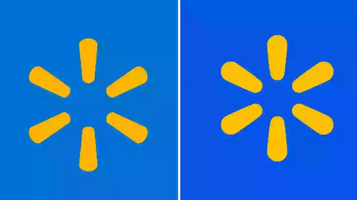
Walmart has changed its logo for the first time in 17 years and everyone is saying the exact same thing.
The retailer giant, which currently boasts 4,615 stores throughout the US, is many shoppers' go-to spot if you're in need of groceries, cleaning supplies, homeware, toiletries, clothing, gifts - the list goes on.
In short, you name it, and Walmart probably stocks it.
Advert

The first-ever Walmart store was opened by founder Sam Walton back in 1962 and, over the years, the chain has seen a number of tweaks and changes.
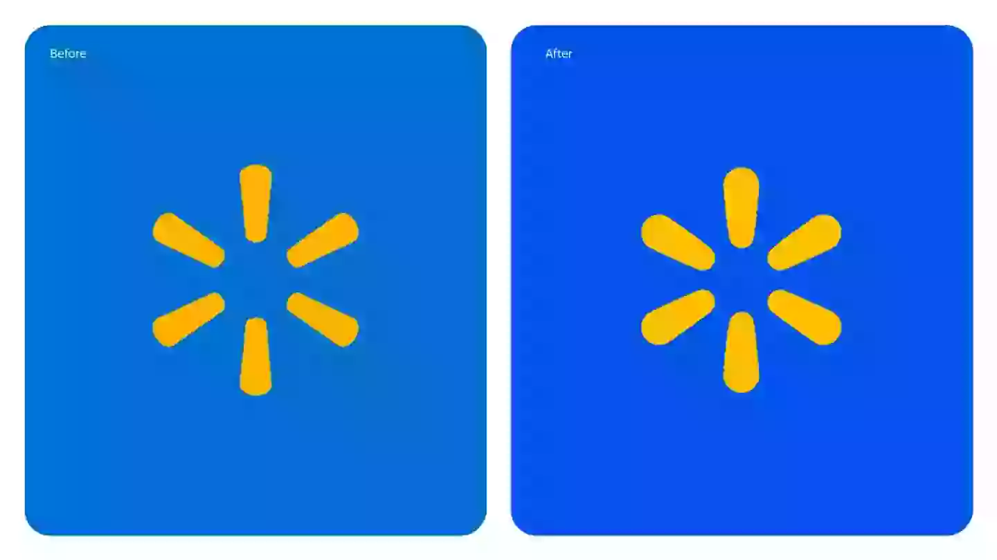
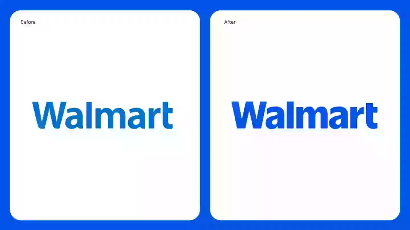
The latest is an all-new rebrand, which sees the emblematic blue and yellow logo as well as the 'Walmart' font updated for the first time in almost two decades.
"Walmart aims to be an inspirational, digital retailer that provides all the products, brands, and services our customers need and want. This update, rooted in the legacy of our founder, Sam Walton, demonstrates our evolving capabilities and longstanding commitment to serve our customers of today and tomorrow," said William White, senior vice president and Chief Marketing Officer, Walmart U.S.
Advert
Speaking of the update, he continued: "While the look and feel of our brand is more contemporary, our refreshed brand identity reflects Walmart’s enduring commitment to both Sam’s principles and serving our customers however they need us. As our customers evolve, we will too.
"Our Walmart will always be their Walmart, and our brand will always be a testament to how we innovate and change alongside them," he added.

After seeing the change, people simply couldn't wait to rush to social media to share their reactions with the majority convinced nothing actually changed that much.
Advert
One Instagram user joked: "Before vs before."
"Some graphic designer out there actually living off doing this rn," slammed a second while a third sarcastically quipped: "WOW WHAT A BIG UPGRADE!"
A fourth chimed in: "Wtf its the same thing."

Advert
"Bro it’s a few shades lighter/darker wtf this ain’t no change?" penned a fifth.
A sixth slammed: "What a tremendous difference."
"They just added a bit of highlight and called it a day," chirped another.
And a final Instagram user somewhat defended: "From a graphic design standpoint it’s not bad, it’s a more modern look with the bolder typeface and adding weight to the logo.
Advert
"It’s nothing to write home about but it’s not like a bad rebrand."
What do you make of Walmart's new and improved logo?
Topics: Food and Drink, Life, Shopping, US News, Social Media, Instagram